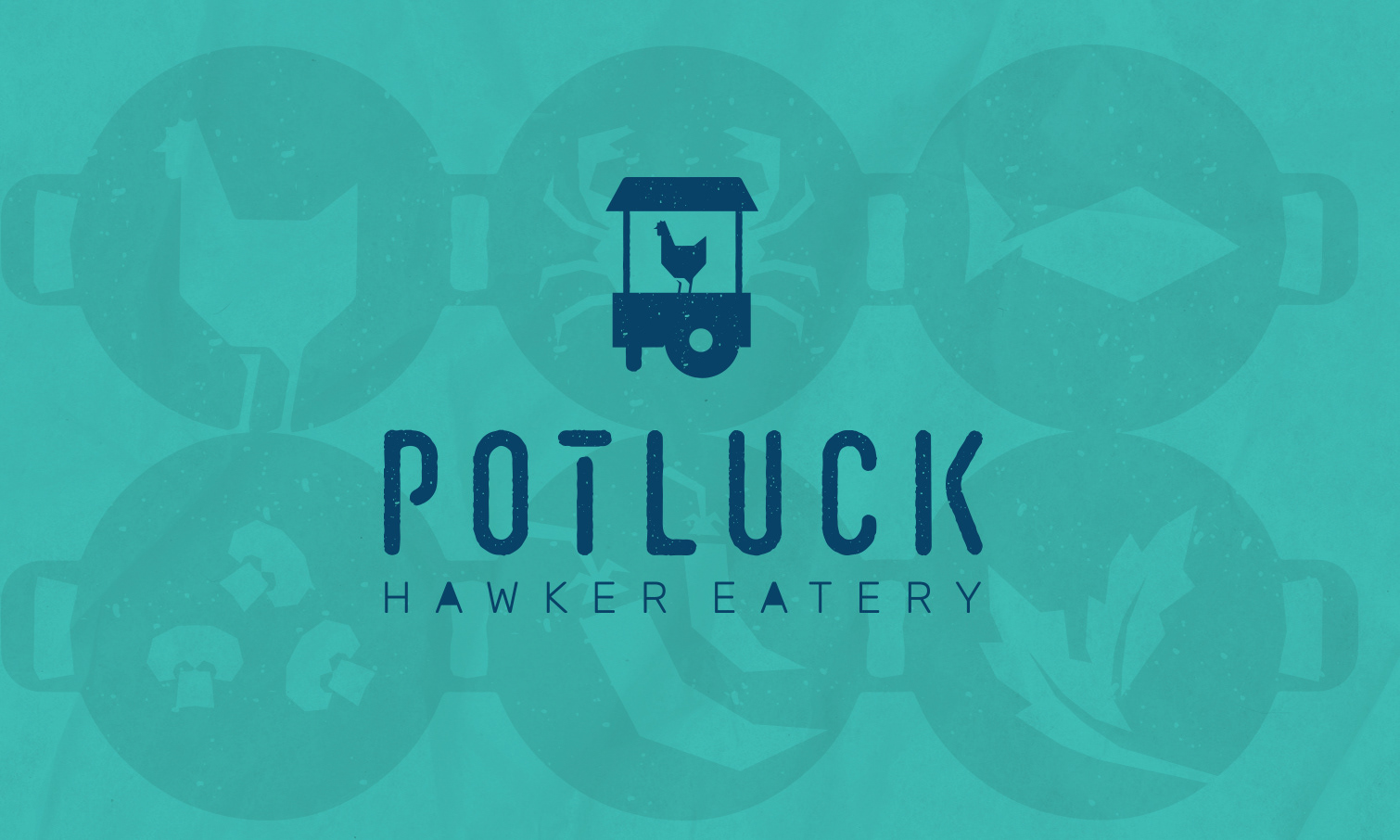
IDENTITY SYSTEMS + VISUAL LANGUAGE
Street Hawker’s identity was built as a flexible and scalable system. The core mark, iconography, and pixel-based graphic language were designed to work seamlessly across signage, packaging, interiors, and digital platforms.
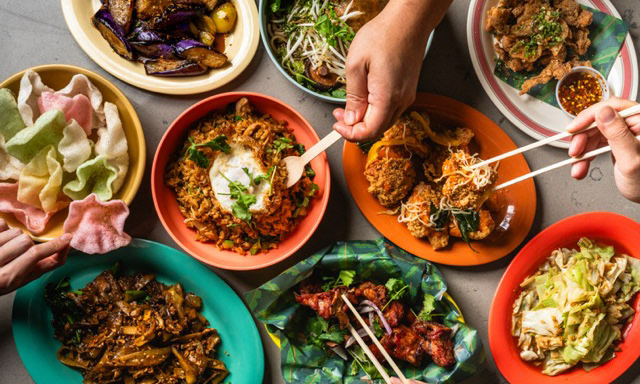
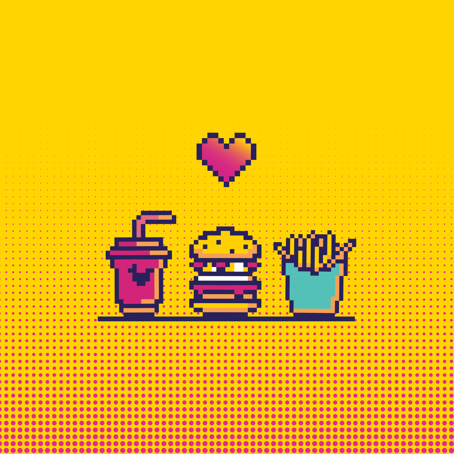
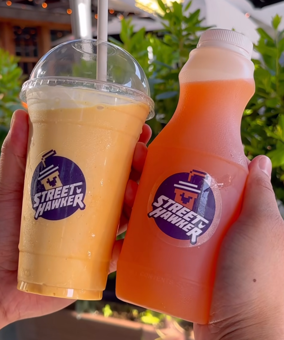
Custom 8-bit icons and patterns were developed one pixel at a time to reflect the brand’s retro arcade-inspired personality. These elements were used in wallpapers, burger wraps, tray liners, and promotional materials, creating a distinctive visual language that felt playful, memorable, and ownable.
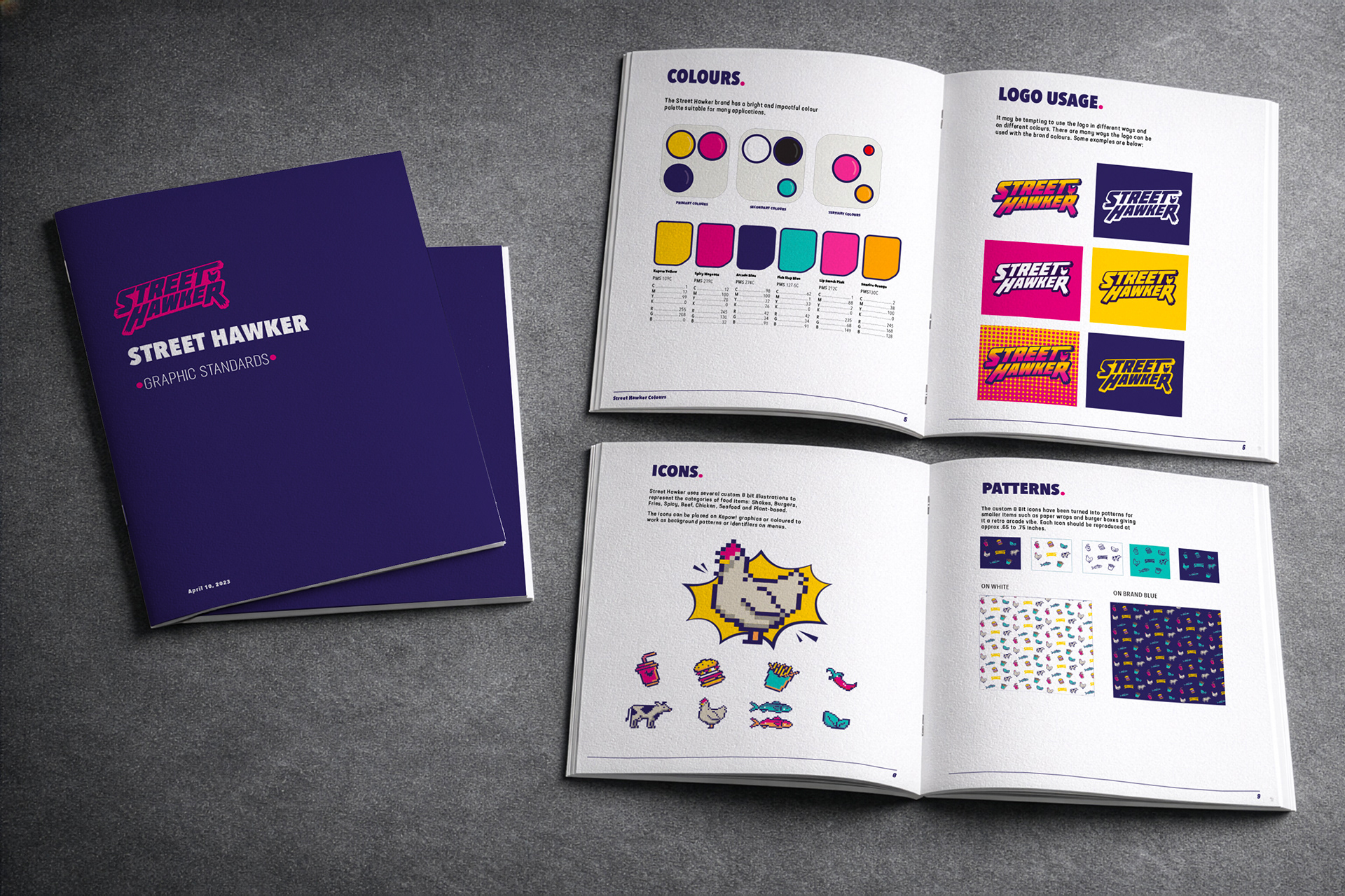
To support consistency so the brand can grow, a comprehensive graphic standards guide was created, outlining logo usage, colour systems, typography, layouts, and applications.
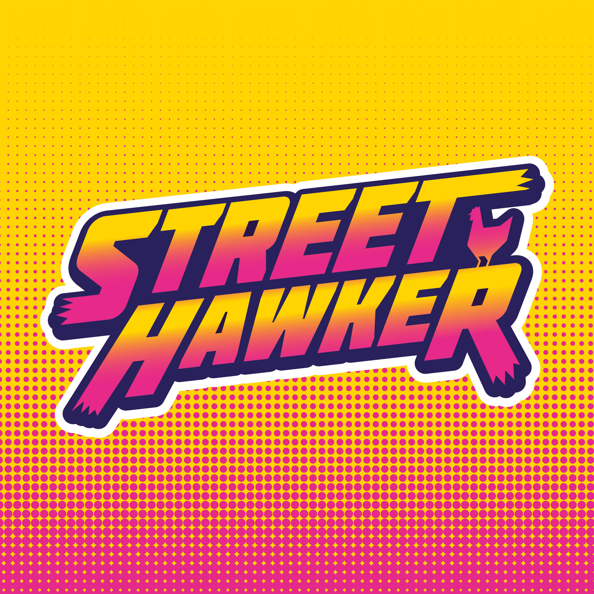
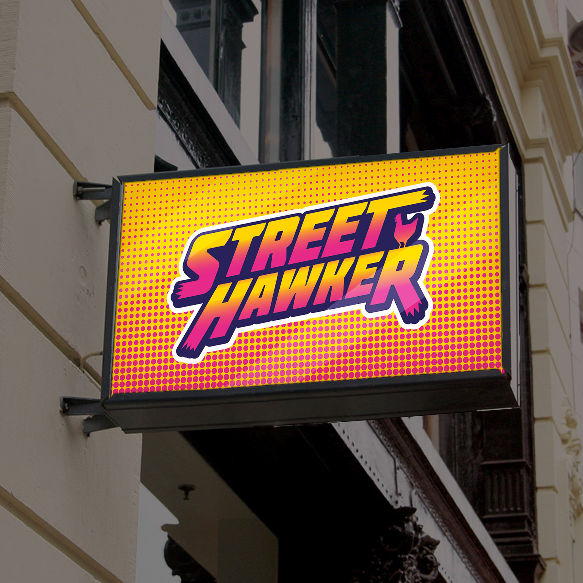
Inspired by Southeast Asian street hawker markets, ’90s arcade culture, and bold comfort food, the brand blends high-energy visuals with nostalgic charm. Bright colour palettes, graphic patterning, and custom typography were combined to create something energetic, memorable, and unmistakably Street Hawker.
The visual system was designed to live everywhere — from walls and menus to screens and social — ensuring the brand felt cohesive no matter where customers encountered it.
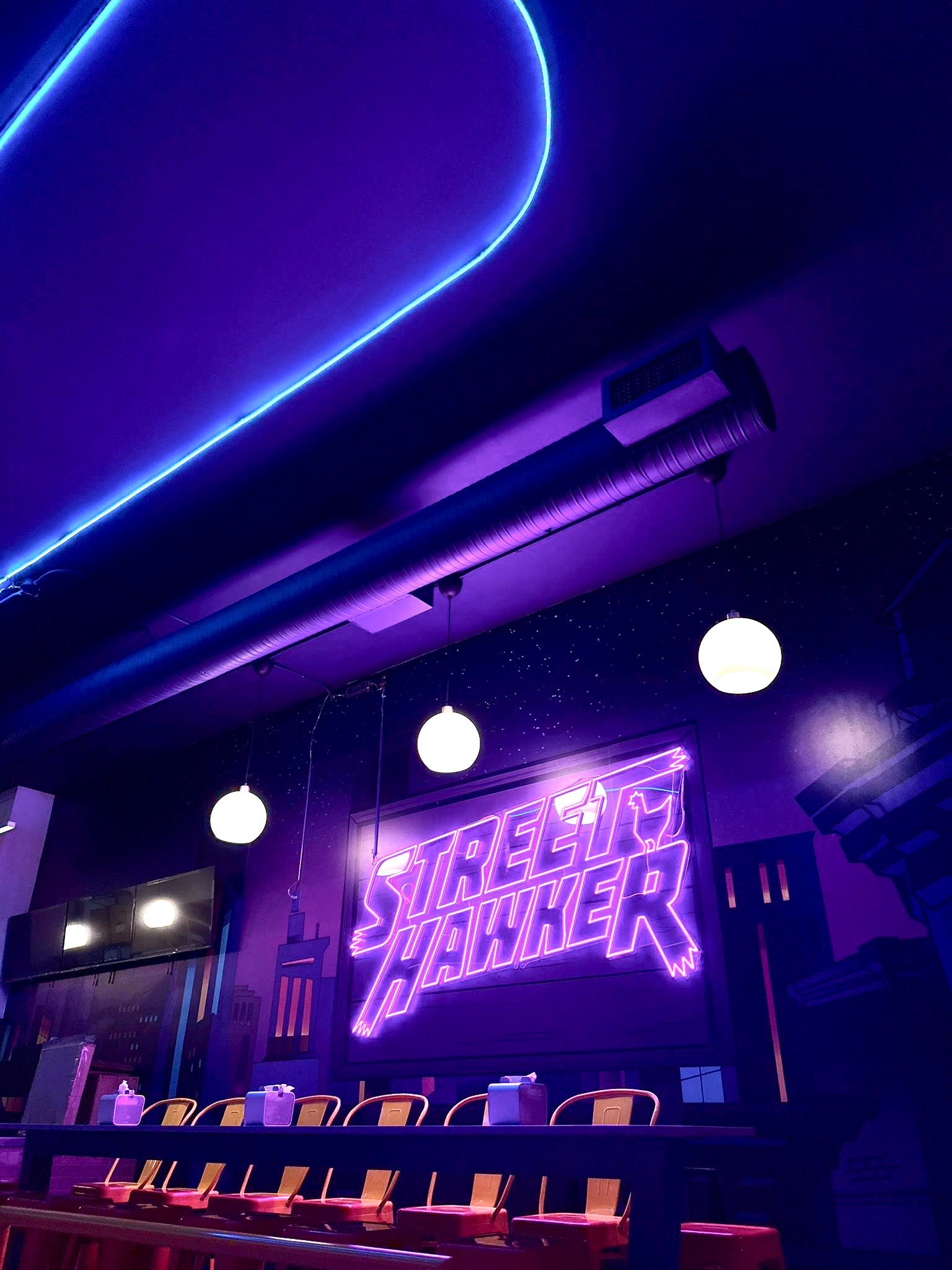
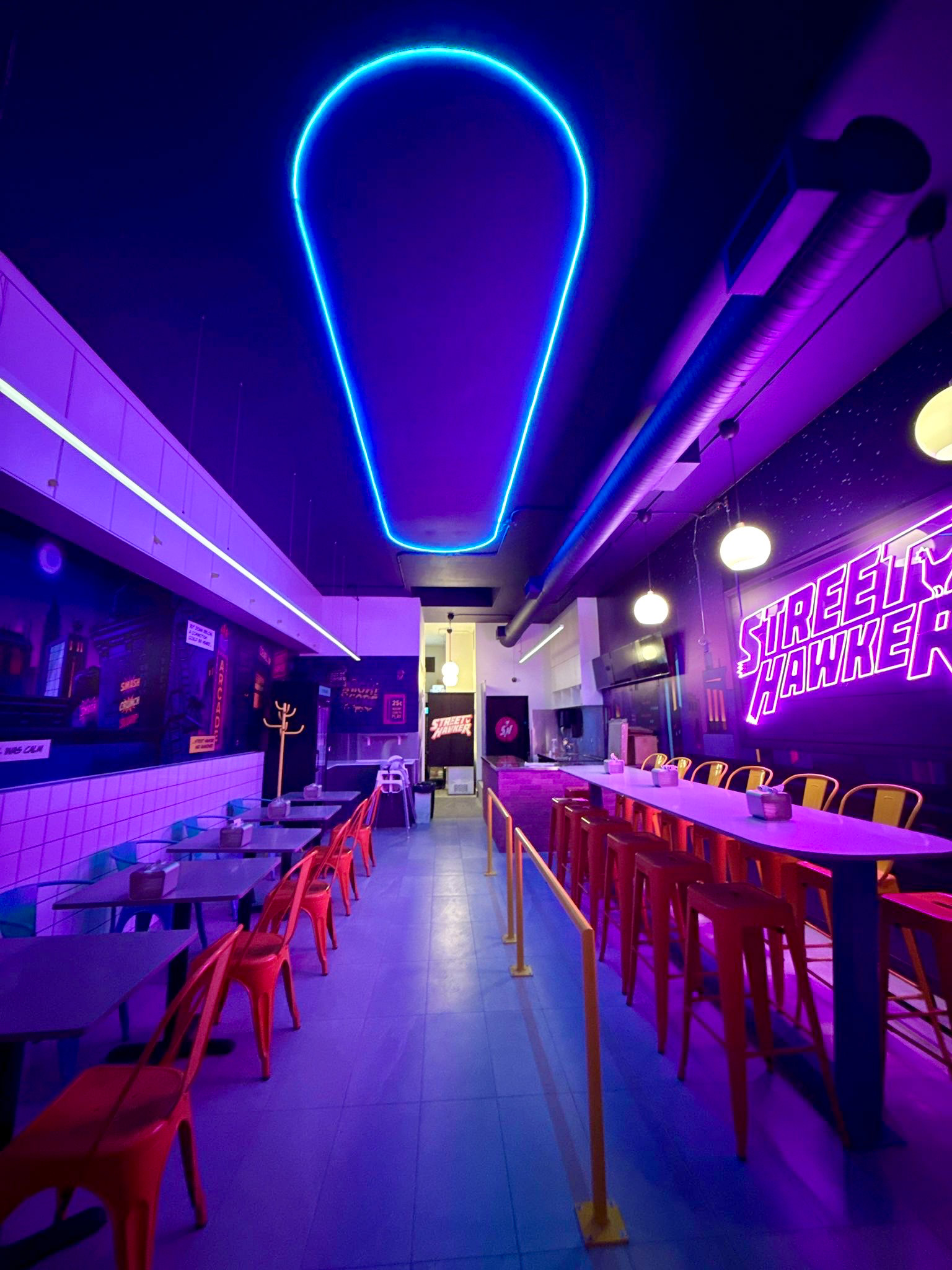
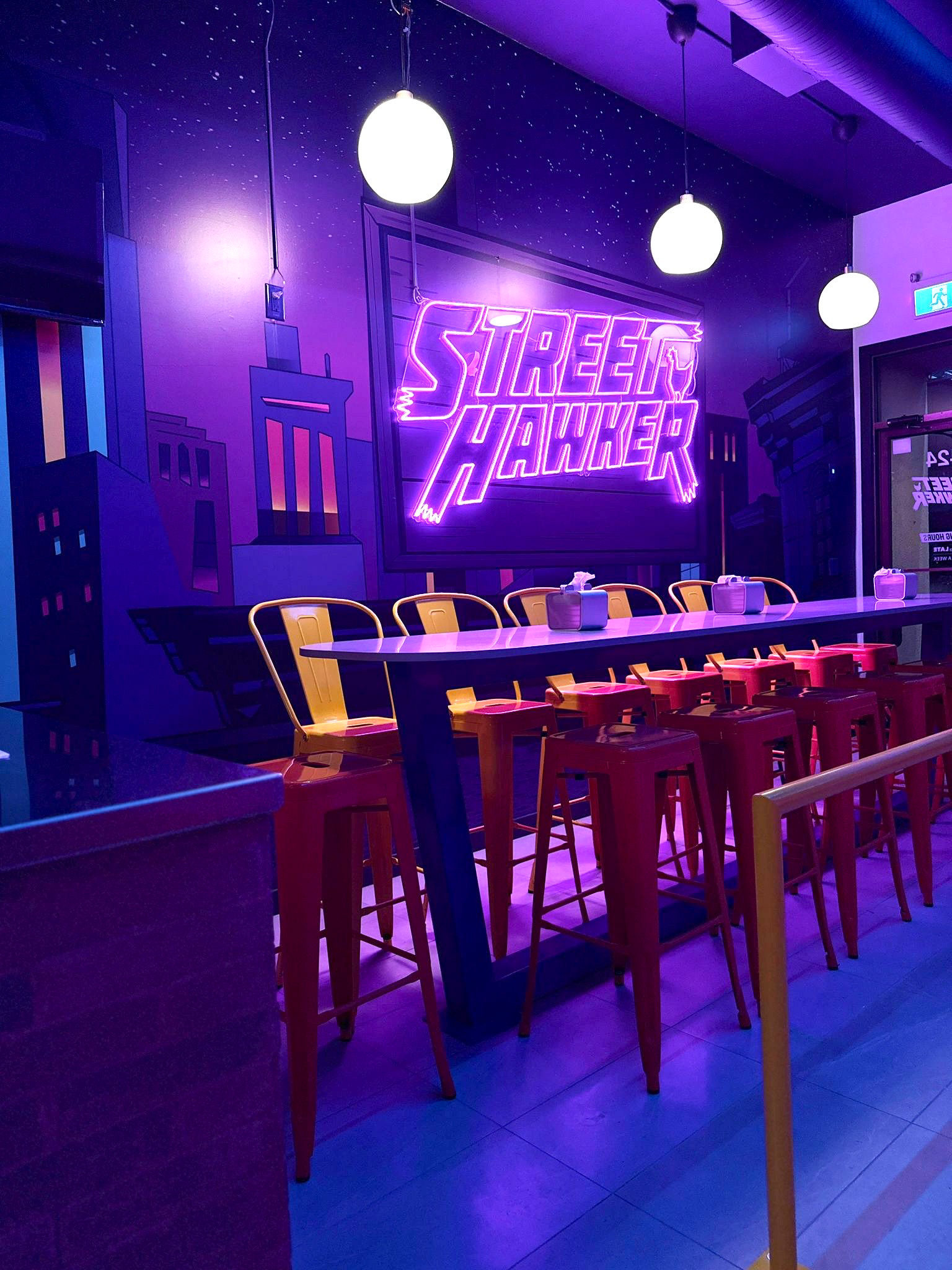
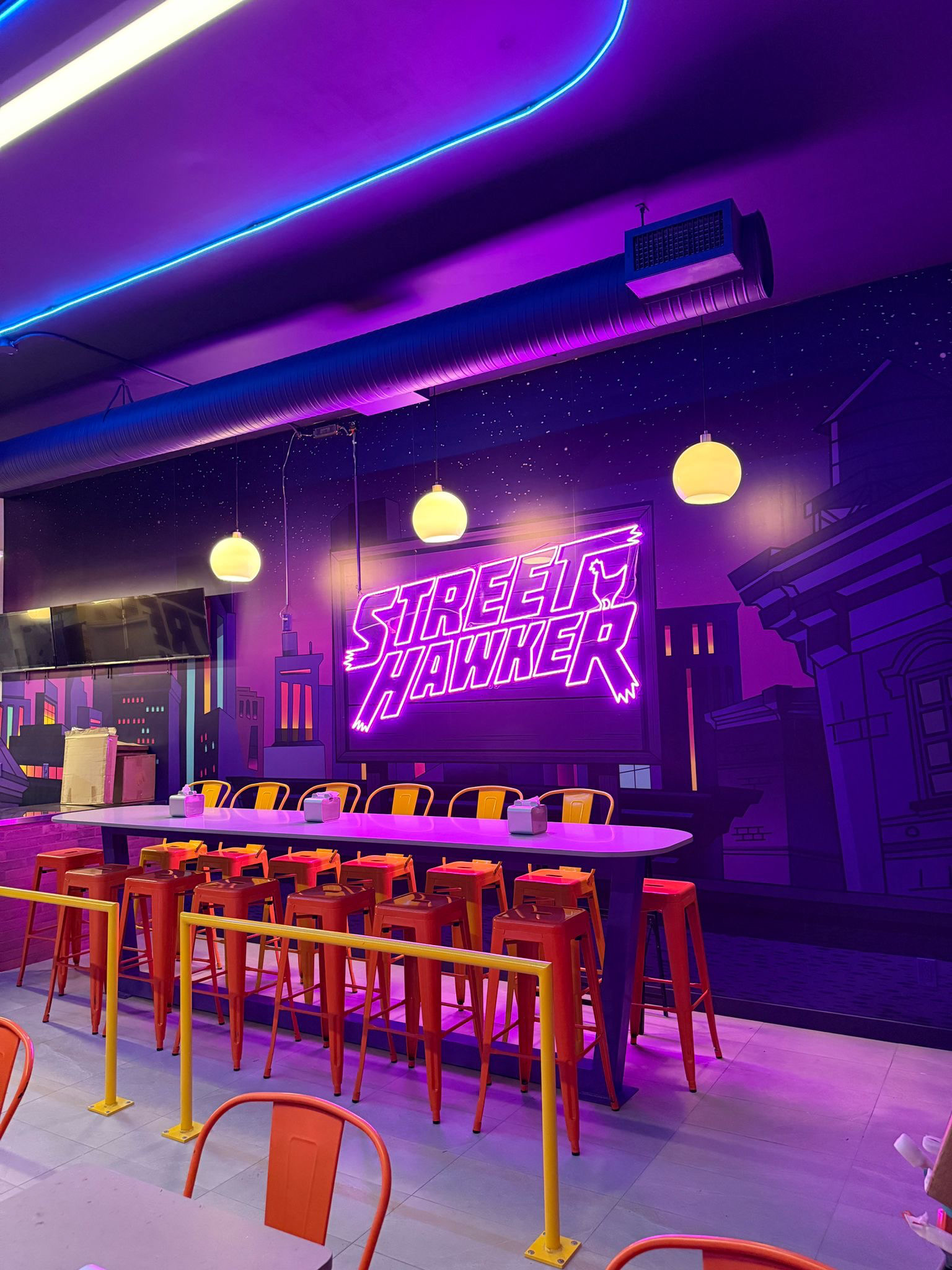
ENVIRONMENTAL + In-STORE DESIGN
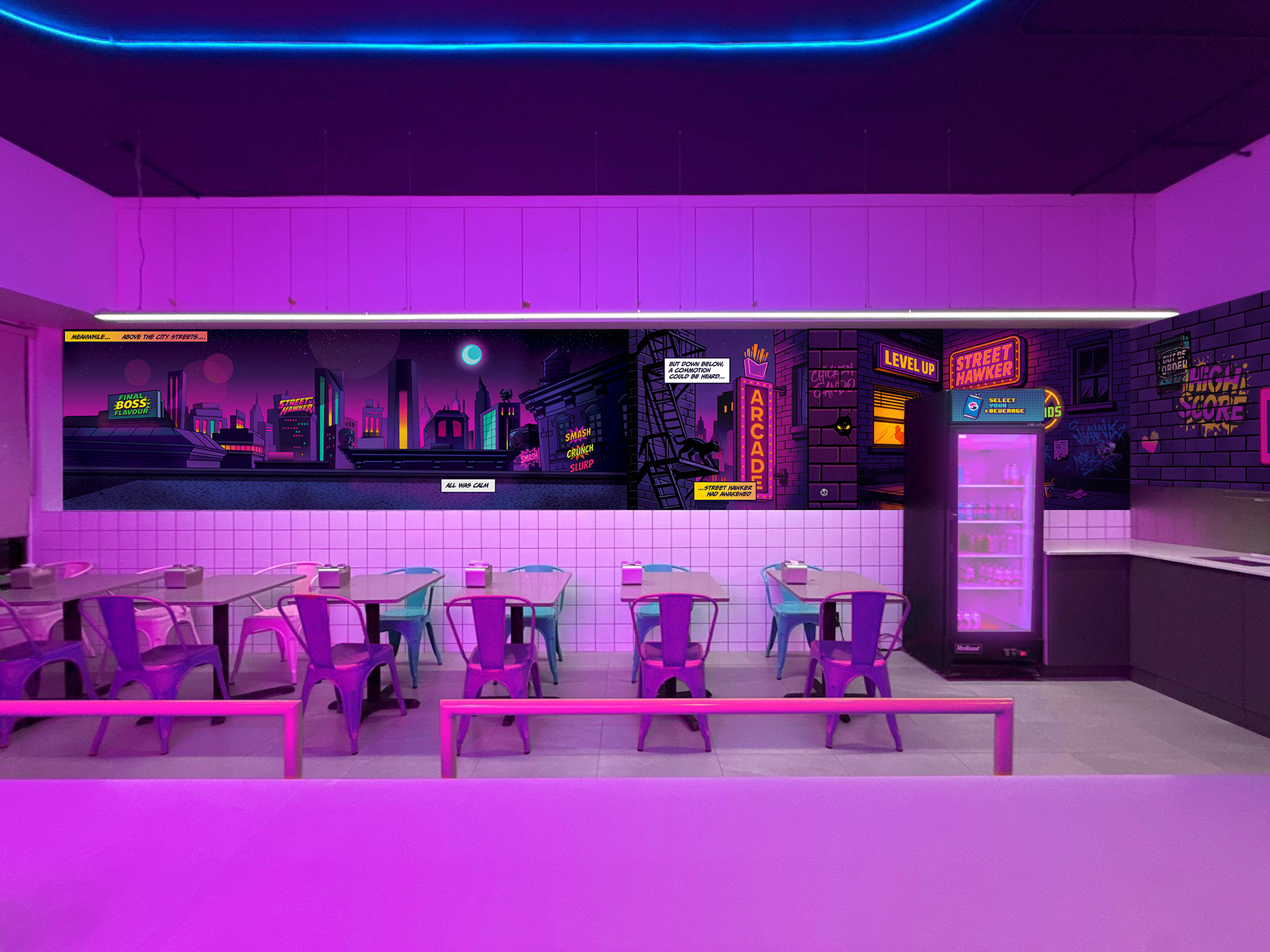
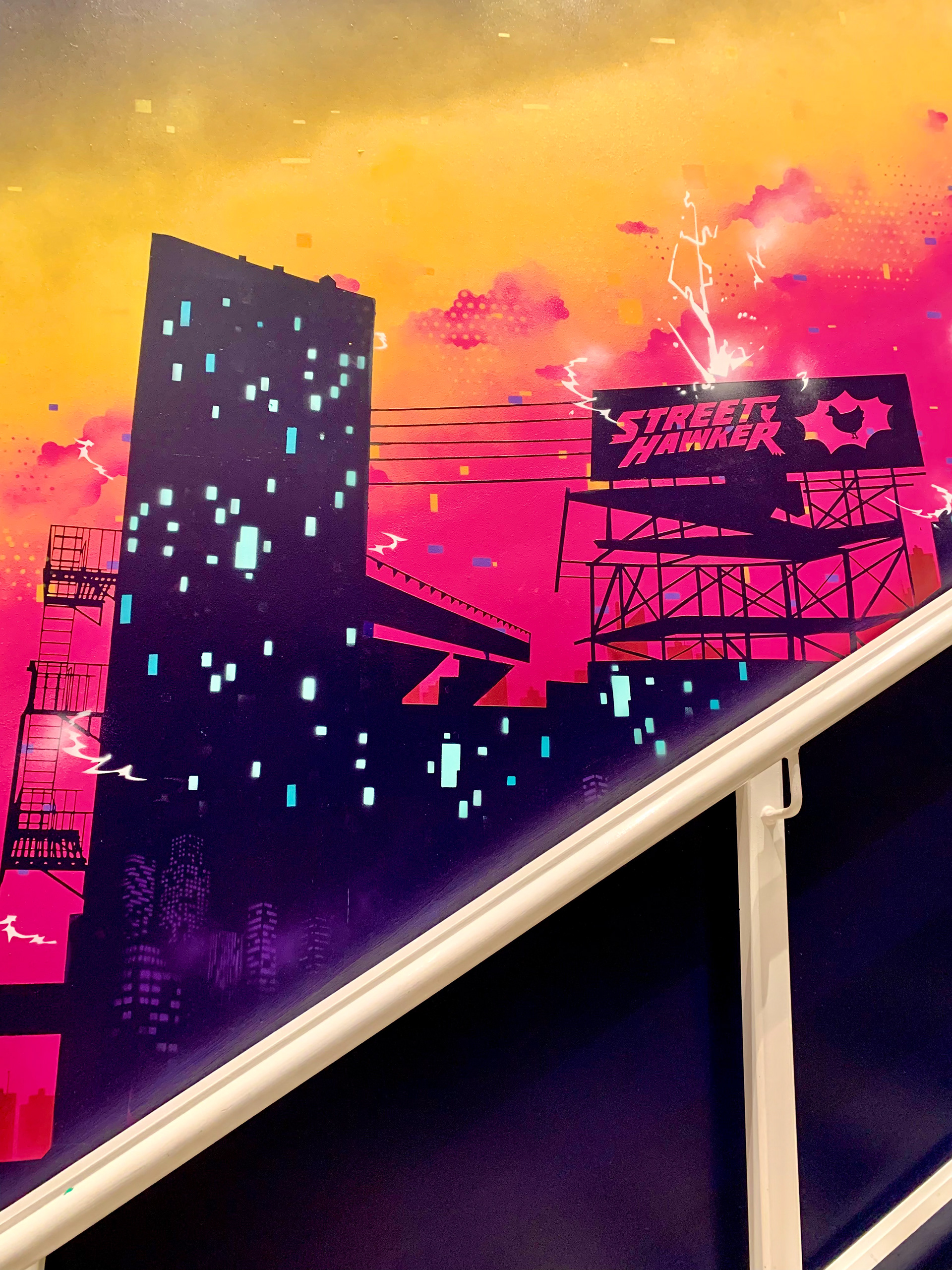
From an eye-catching store-front to the in-store experience – every surface was designed to feel as bold and immersive as the food itself. From exterior signage to interior murals, everything was considered as an opportunity to reinforce the brand.
Leading the design of the main wall mural in collaboration with a local graffiti artist, we translated the brand’s digital language into a large-scale physical installations. Custom 8-bit wall dividers, tray liners, burger boxes, and packaging also brought the space to life.
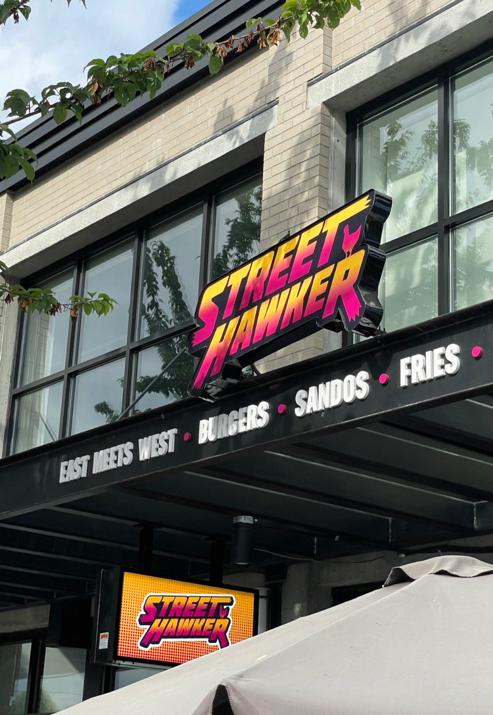
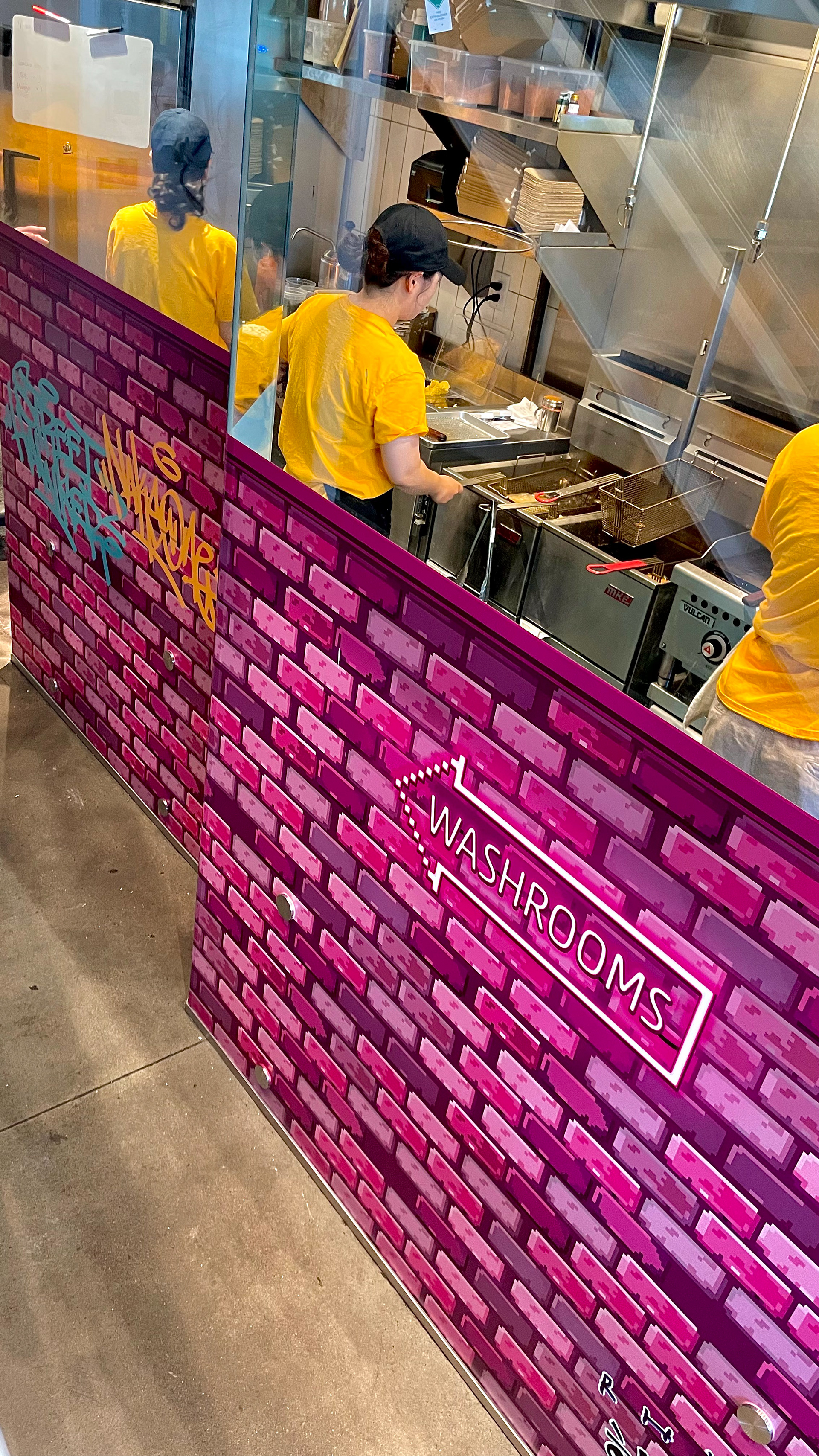
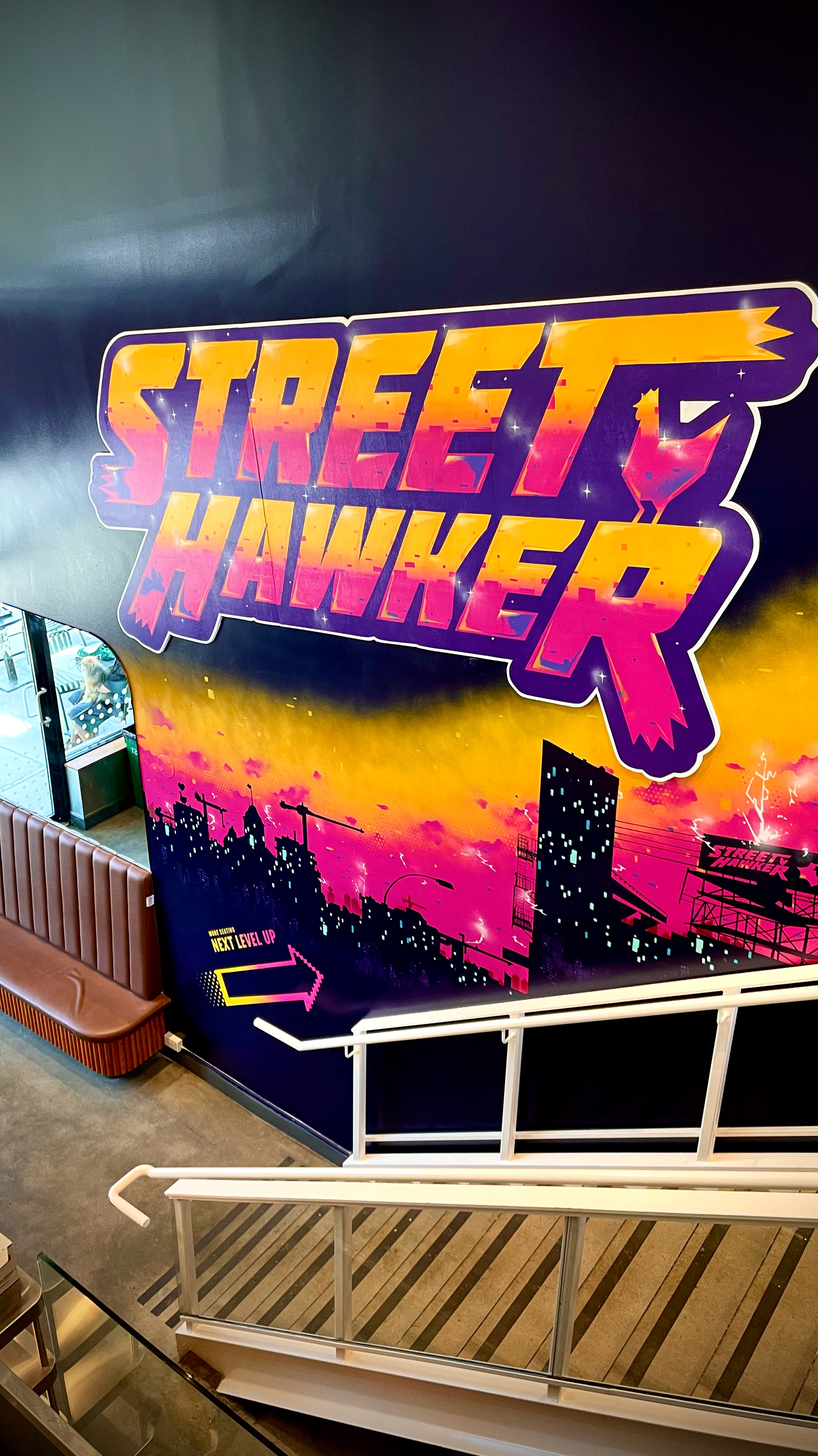
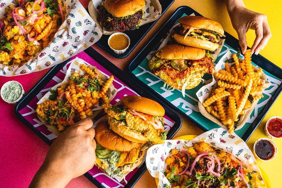
Photo Credit: Rich Won
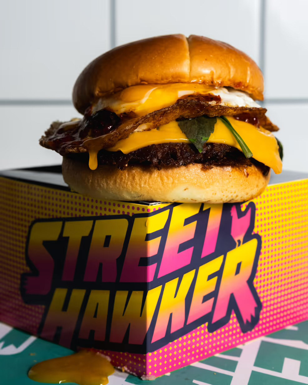
Photo Credit: Rich Won
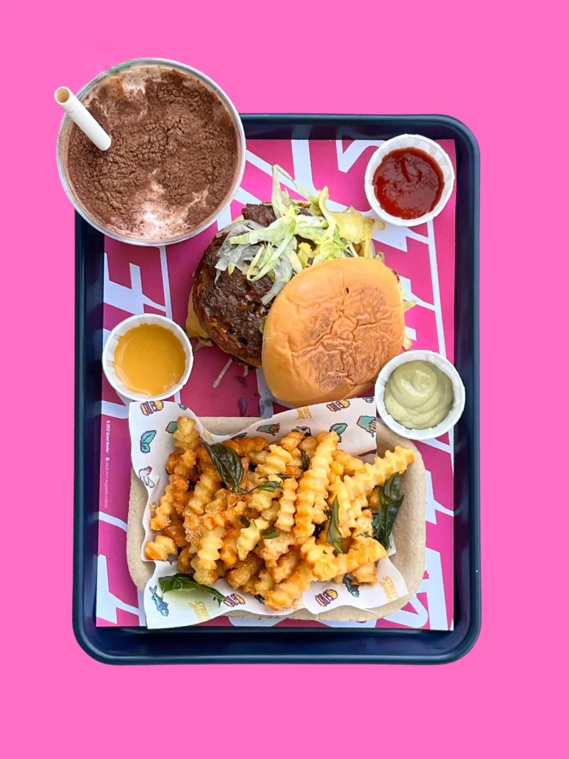
Photo Credit: Rich Won
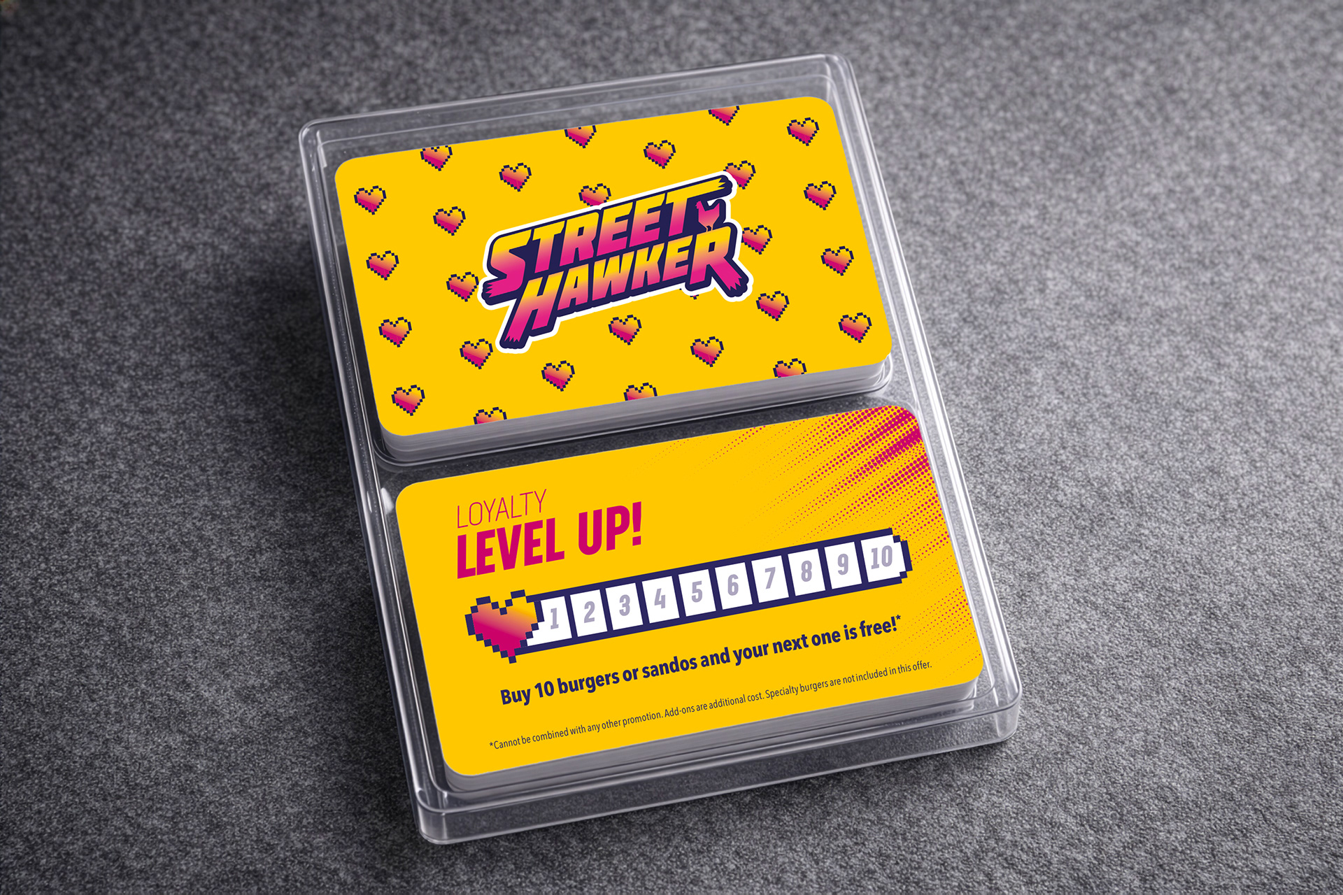
LOYALTY + GIFT CARDS
To support customer retention and promotions, every detail was considered, including a series of loyalty cards and gift card designs.
Seasonal variations were introduced throughout the year, including custom holiday patterns and snowflake graphics, allowing the brand to evolve while staying consistent.
Street Hawker has been featured in leading local food and culture publications for its distinctive concept, visual identity, and in-store experience, including Purple Chives, Scout Magazine, Vancouver Is Awesome, and The Georgia Straight.
“Bold, playful and clever — right down to the graphics.”
— Scout Magazine (crediting designer Graeme Jack)
— Scout Magazine (crediting designer Graeme Jack)
“What makes Street Hawker stand out isn’t just the food — it’s the personality of the brand, from walls to menus.”
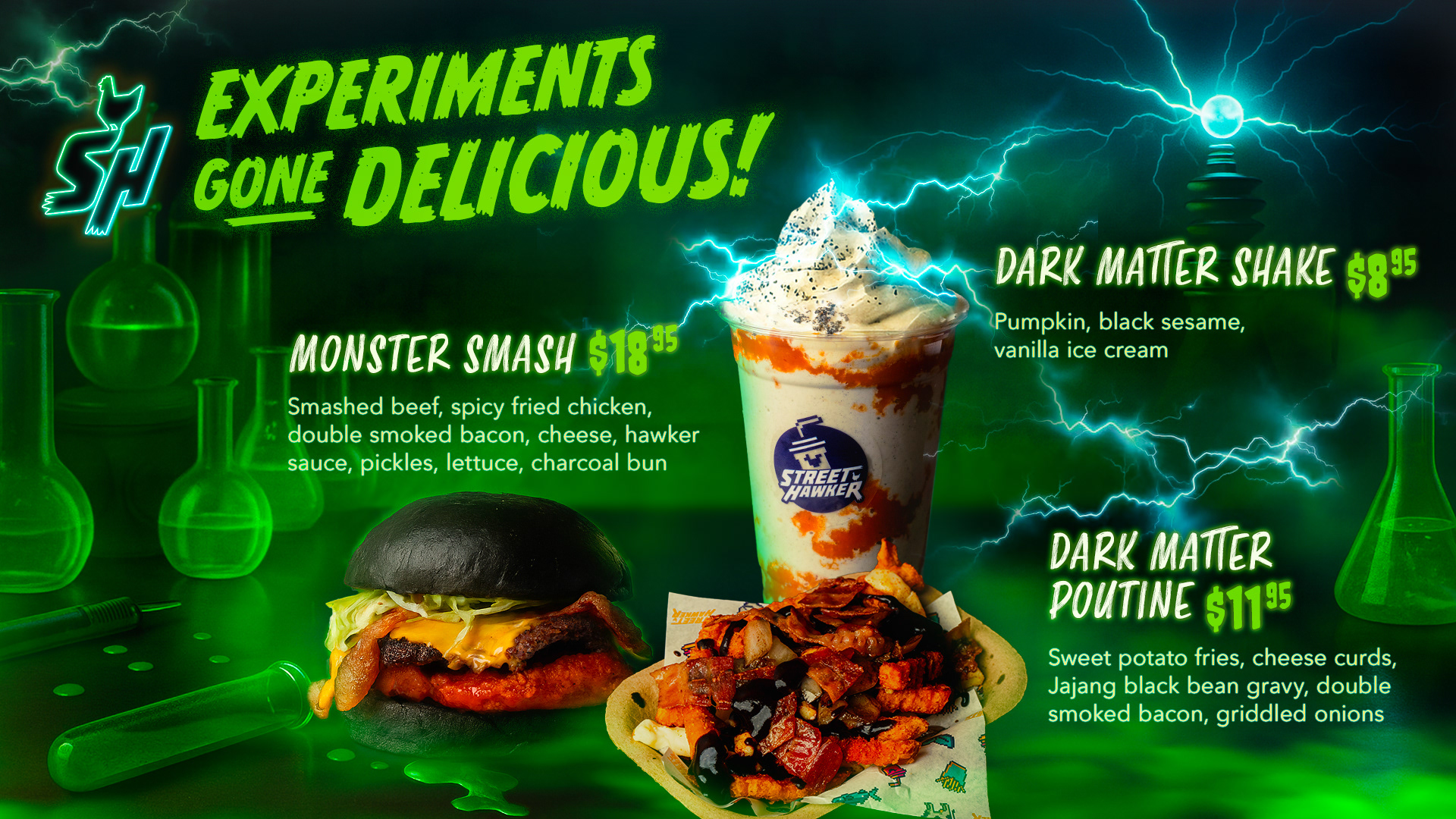
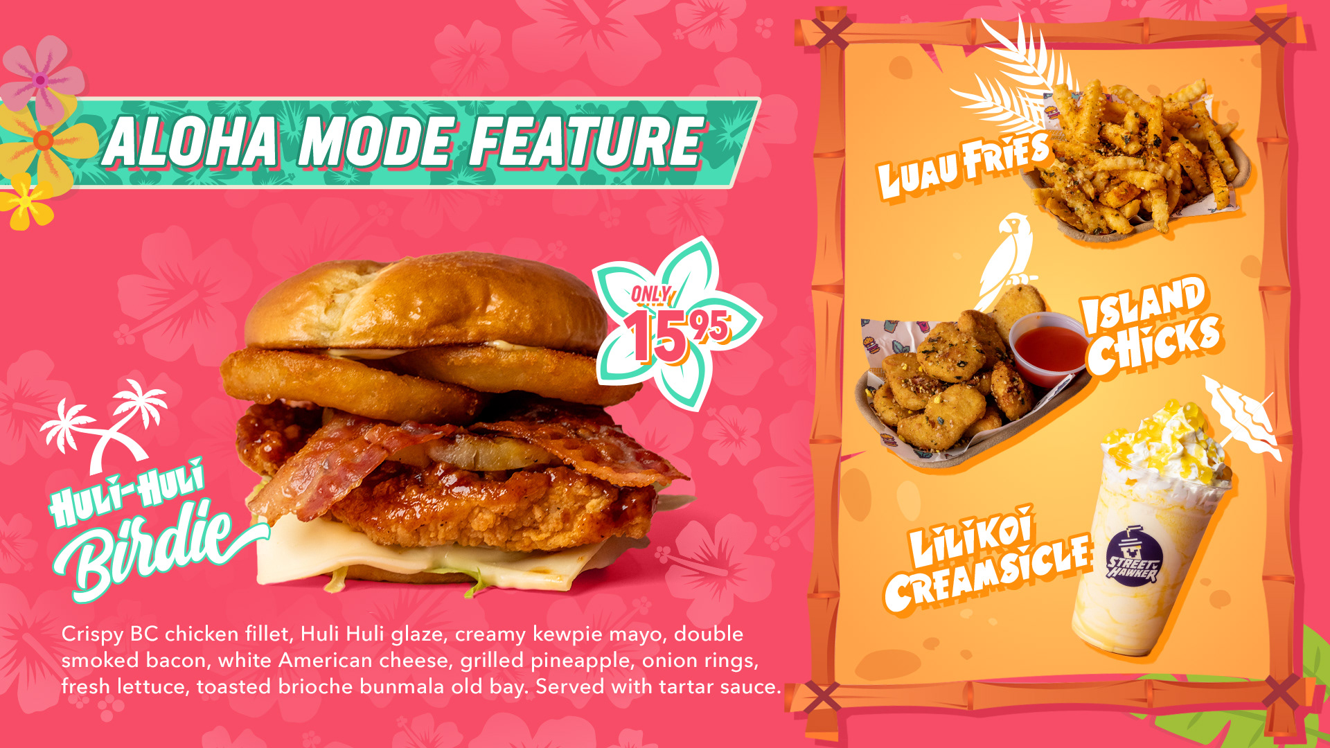
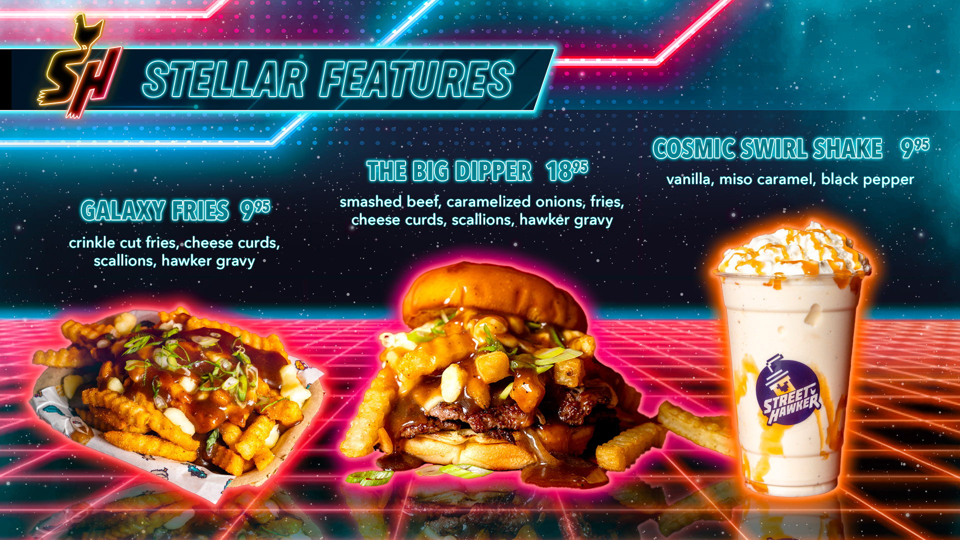
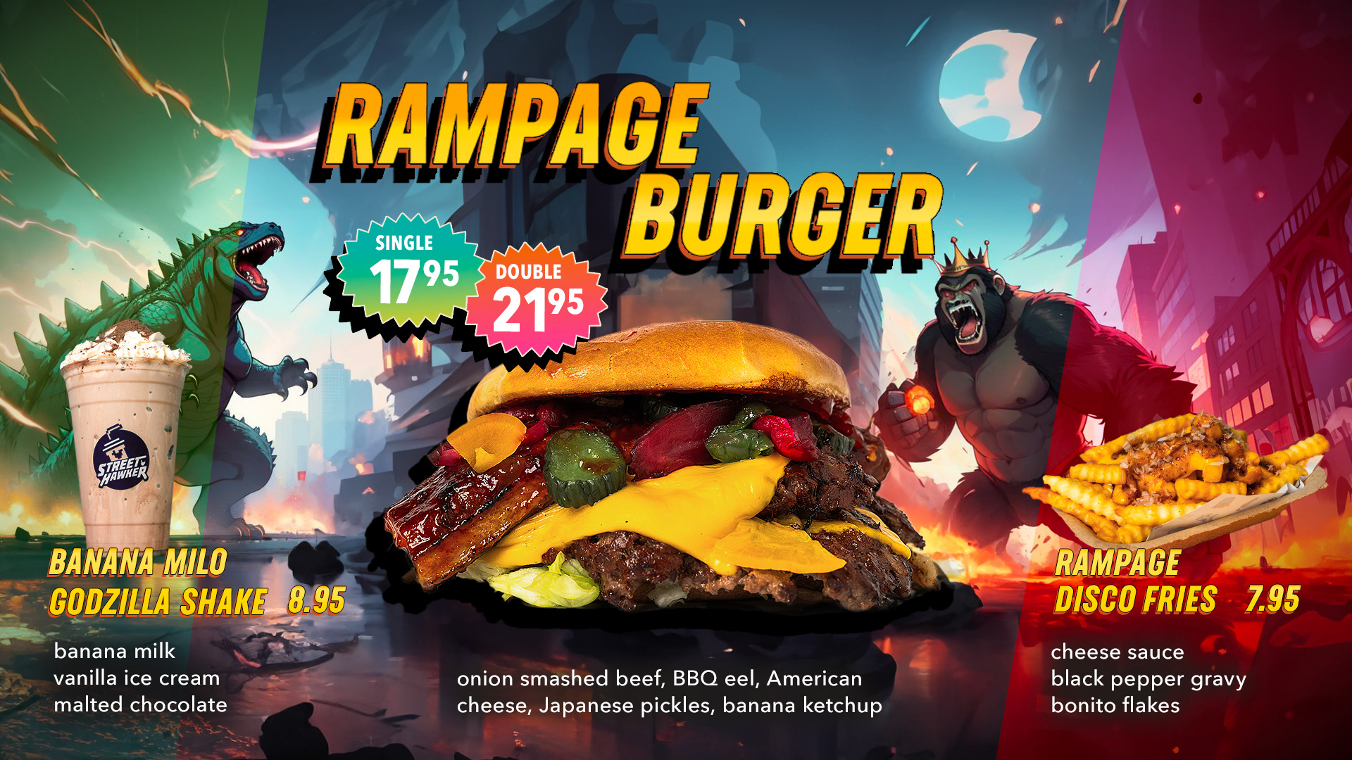
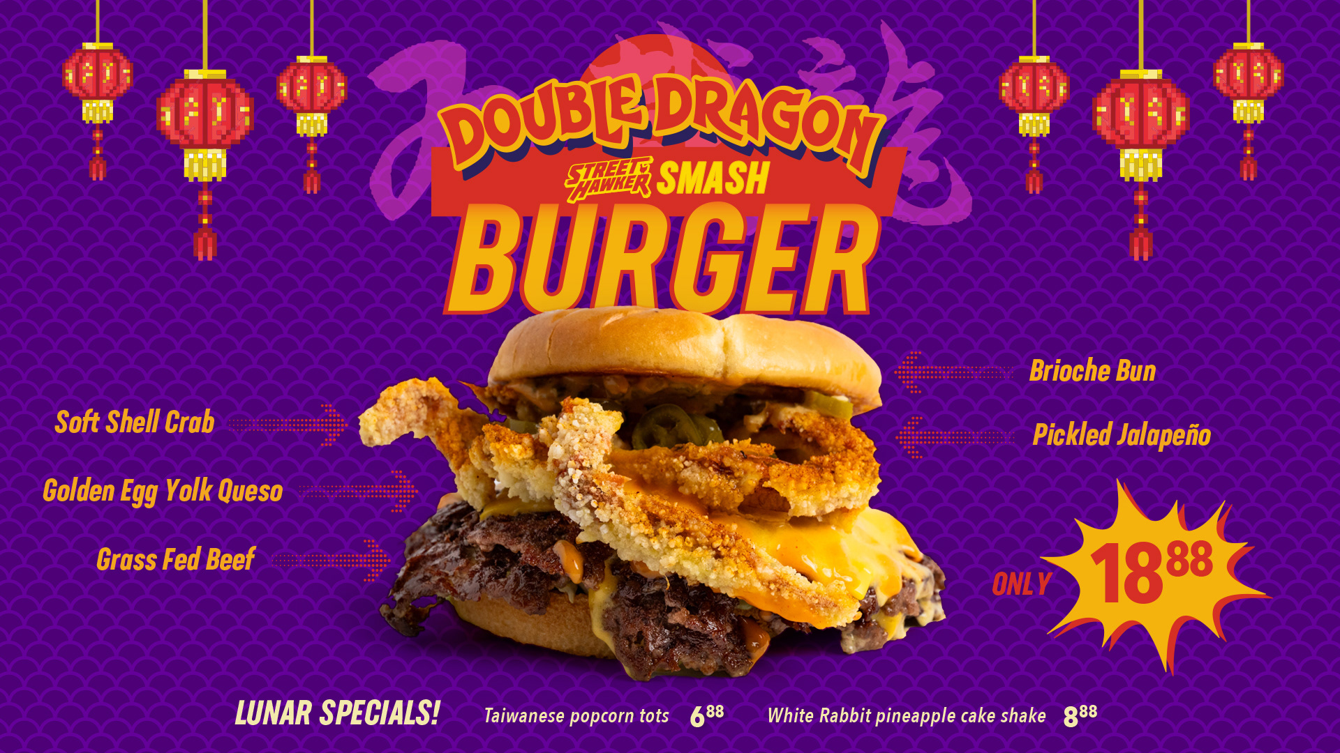
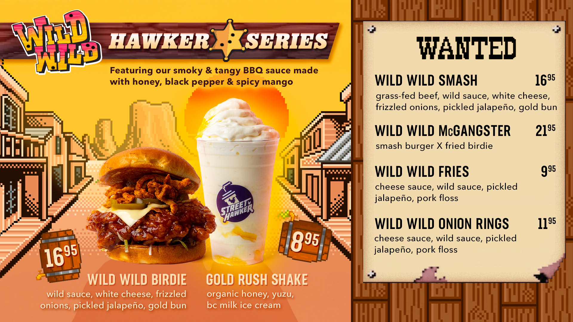
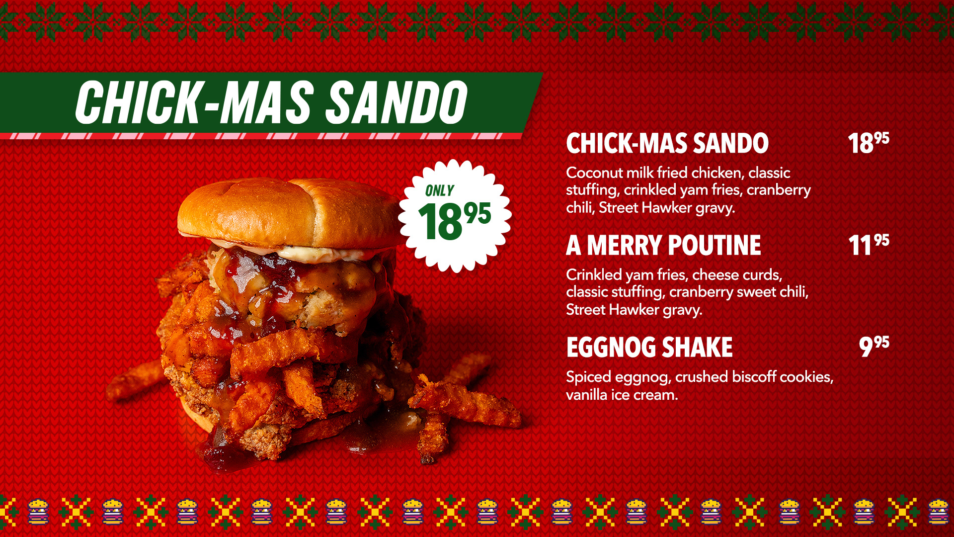
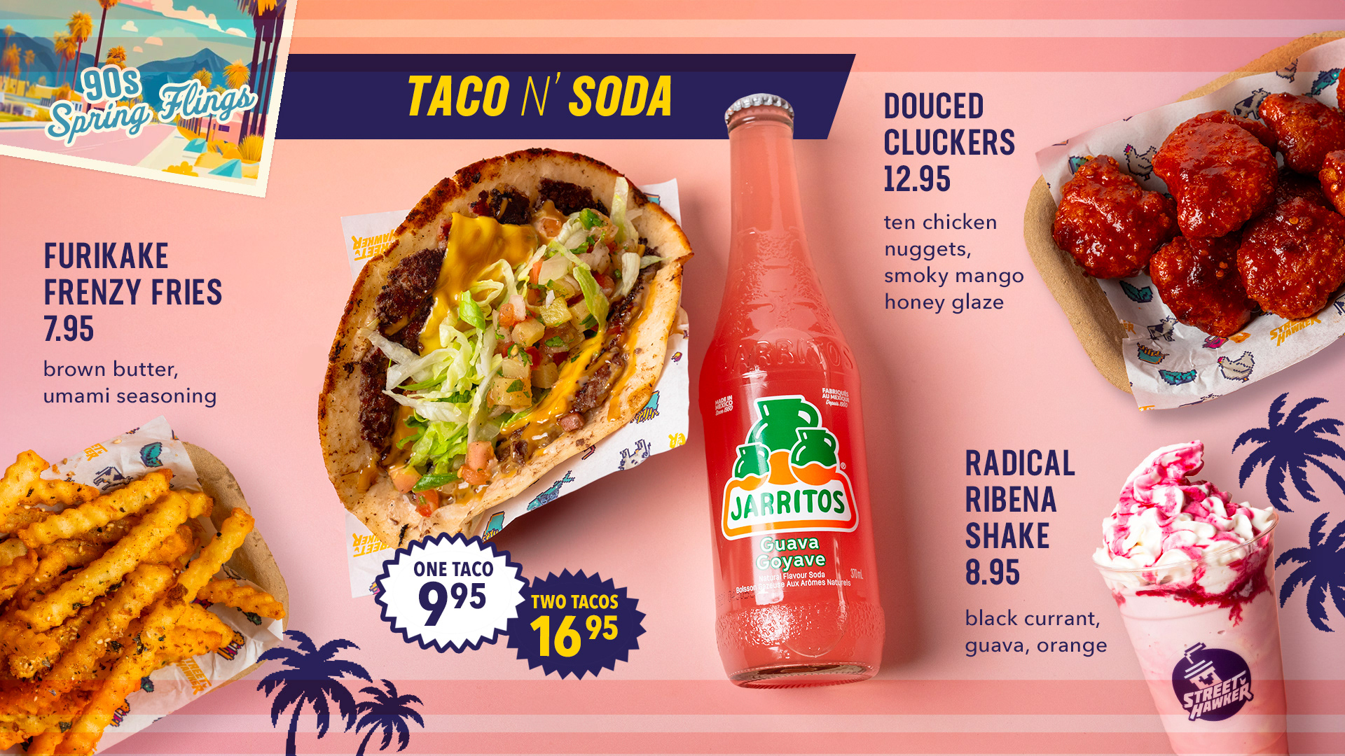
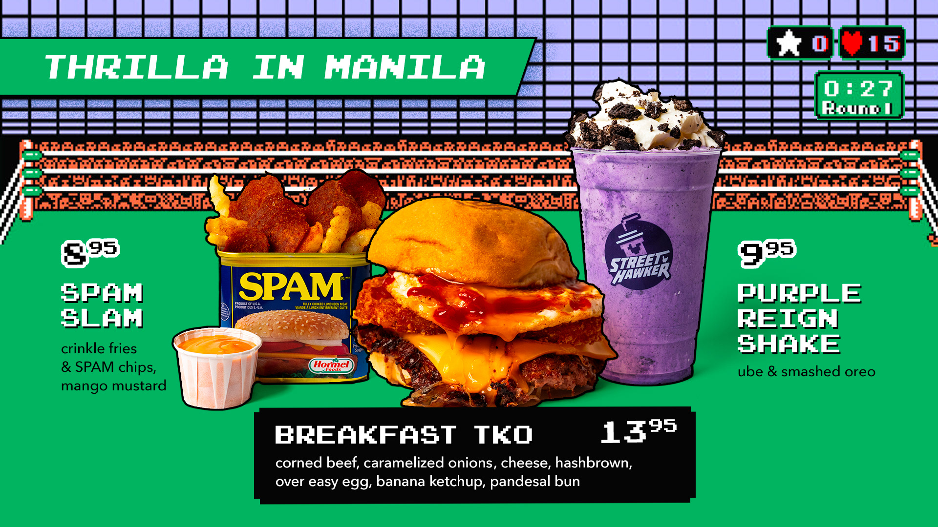
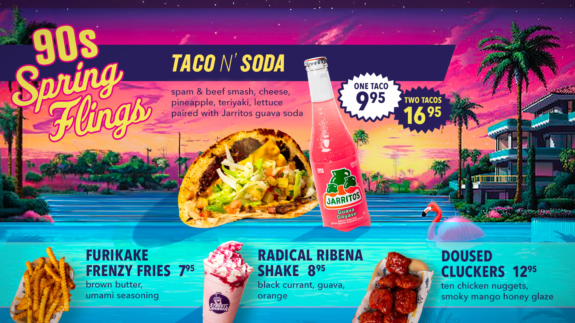
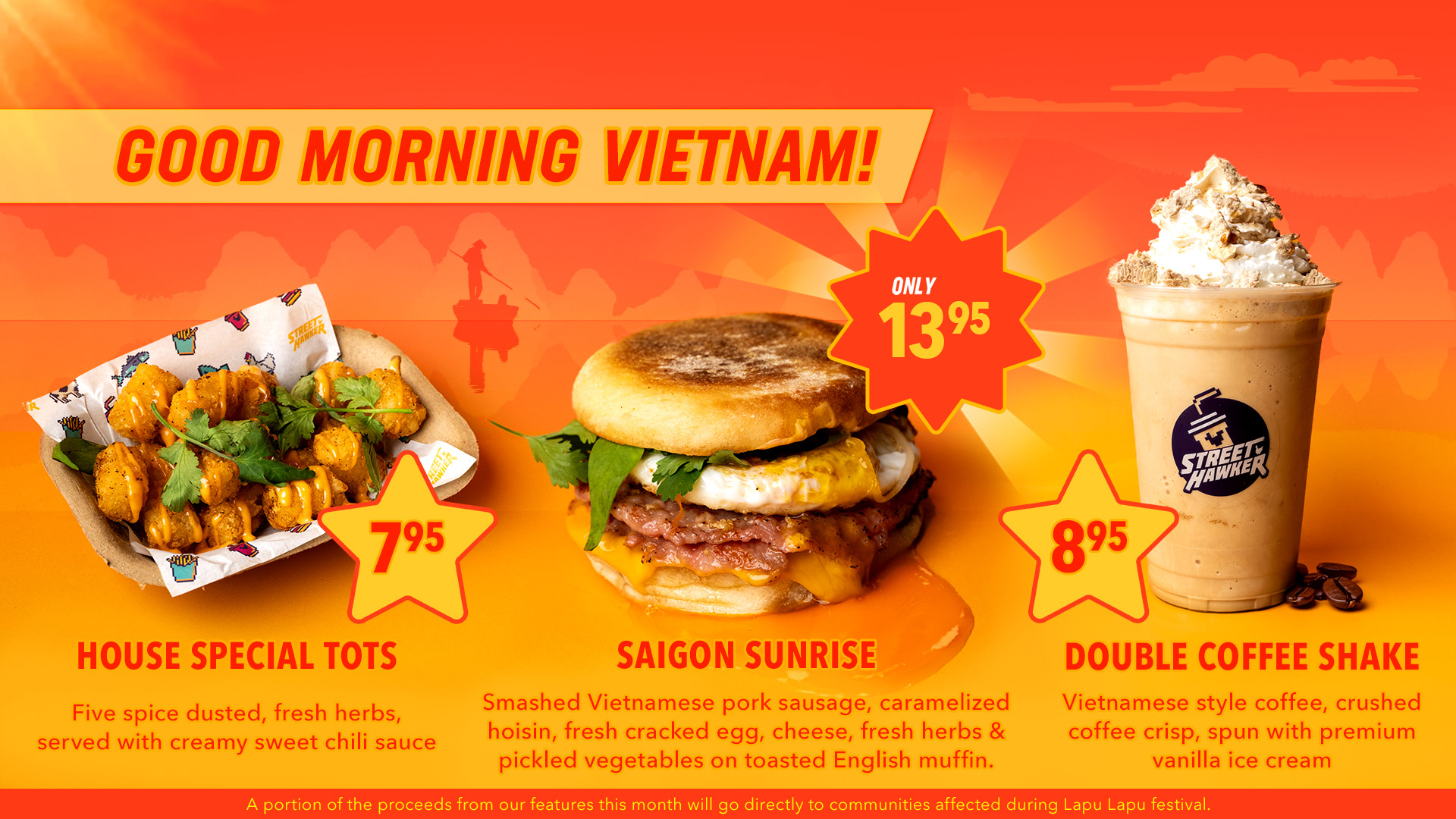
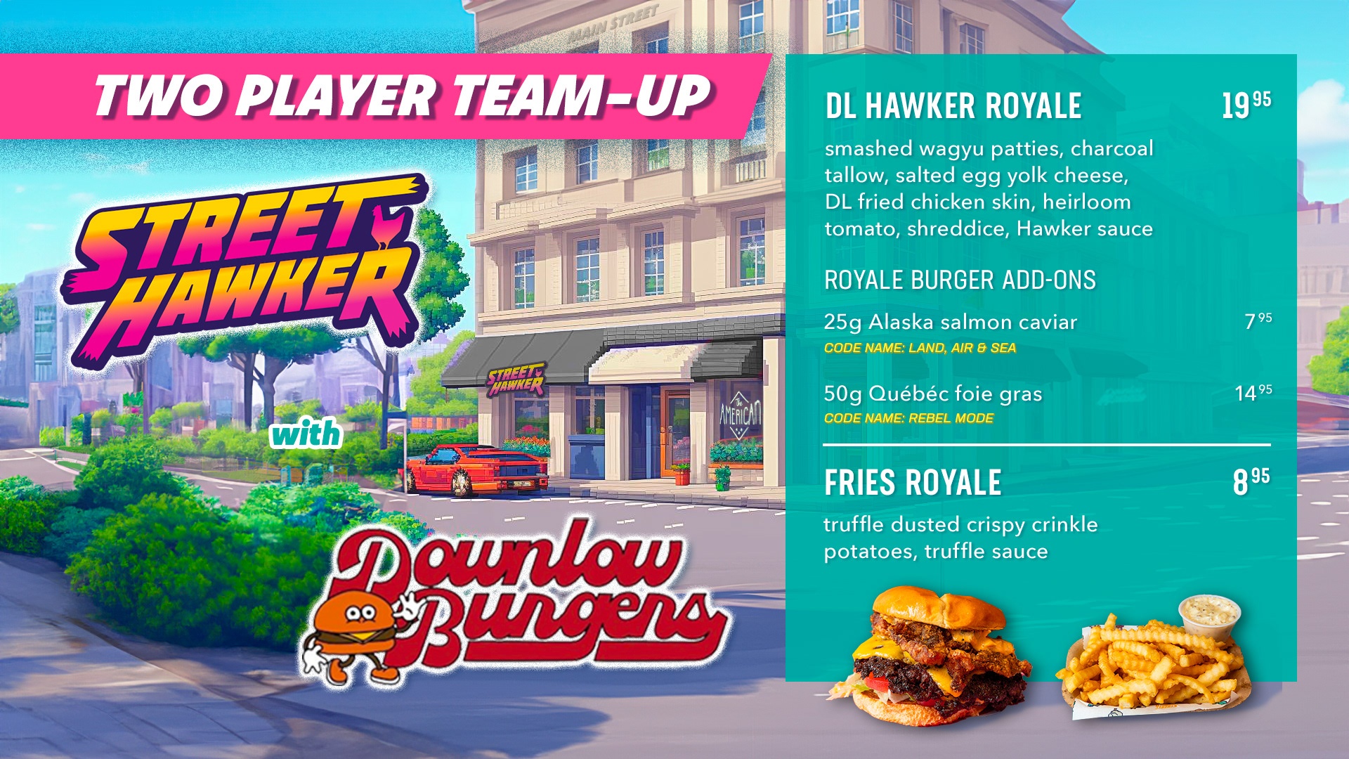
DIGITAL MENUS
A custom digital menu design was created to showcase monthly features, promotions, and seasonal offerings in restaurant.
Each screen was treated as a canvas to play in, incorporating custom typography, motion, illustration, and vibrant colours to build excitement for the food. Over time, more than a dozen feature layouts were created, helping keep the in-store experience fresh and engaging and embodying that addictive 90s arcade energy.
EXPANSION: StreET HAWKER TURBO
Building on the massive success of the original location, Street Hawker expanded with Street Hawker Turbo in Cambie Village — designed to be a late-night, high-energy concept with a darker, neon-infused aesthetic.
The Turbo identity leans into ’90s comic-book illustration, glowing neon treatments, and arcade-inspired lighting. Custom artwork, patterns, and graphics create a distinct brand evolution while still working with the overarching brand. The eclectic energy and design of Street Hawker has helped it stand out and become a popular hot spot in the Vancouver food scene. And of course, the amazing food doesn't hurt either!